Is it considered professional to use the same typography for both headings & body copy on a website? Many leading companies currently adopt this approach. My short answer is yes: a single typeface family can look highly professional when it creates a clear visual hierarchy and remains comfortable to read.
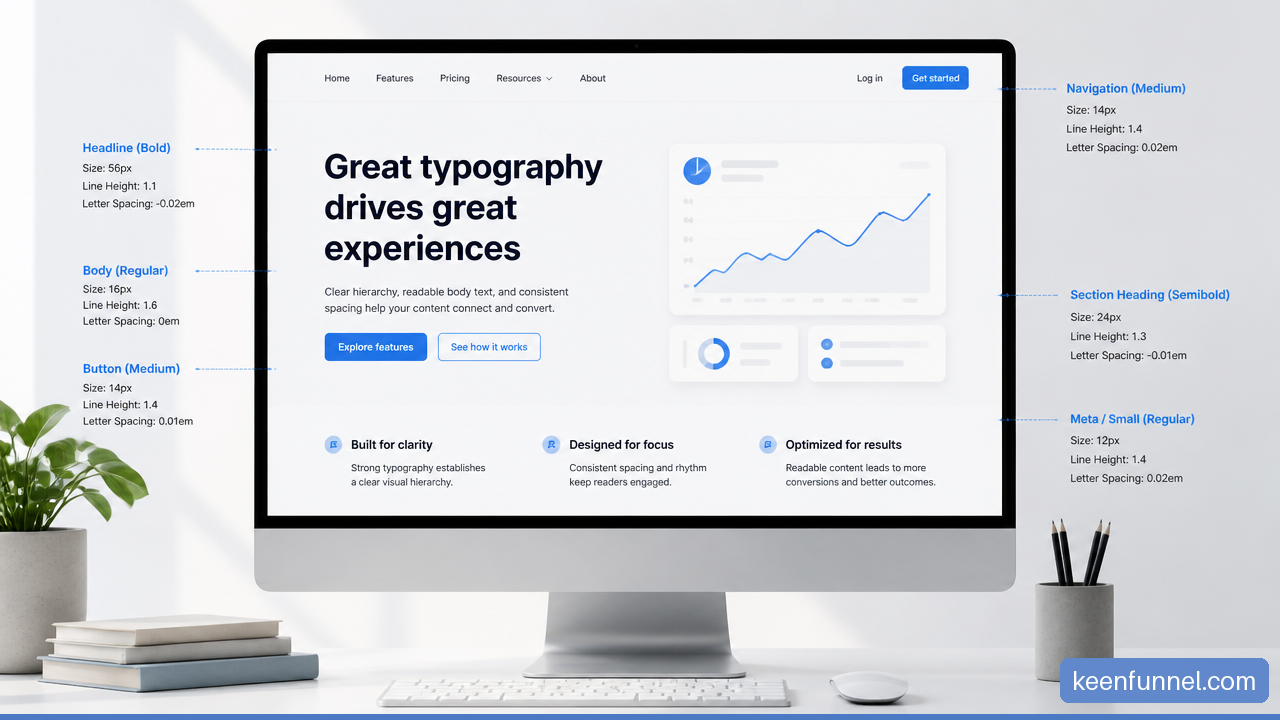
The question is not really whether a website uses one font or two. The more useful question is whether visitors can instantly tell what to read first, what is supporting information, and what is ordinary body copy. If every text element appears similar, the page feels flat. If the system gives each level a clear role, one family can feel controlled, modern, and distinctly branded.
Table Of Contents
• Why One Typeface Can Look Professional
• How Hierarchy Works Without Font Pairing
• When One Family Is the Better Choice
• How To Build A Professional Same Family System
• Key Takeaways
• Frequently Asked Questions
• Sources And References
Why One Typeface Can Look Professional
Professionalism Comes From Order, Not Font Count
Using the same typography for headings and body copy is professional when the design still communicates an obvious order of importance. In typography, this is called visual hierarchy: the way size, weight, spacing, placement, and contrast show readers what matters most.
A well designed website can use one family for an H1, section headings, buttons, navigation labels, captions, forms, and paragraphs. The text does not need a different family to perform a different role. It needs to look and behave differently enough for its role to be clear.
A single family can also reduce visual noise. Instead of asking two unrelated typefaces to coexist, the design draws from a shared set of letter shapes, proportions, and spacing. This often produces a more consistent visual rhythm, especially on product pages, B2B websites, documentation hubs, and content libraries with many reusable components.
That said, consistency is not the same as sameness. A page where every element is 16px, regular weight, and similarly spaced may be technically consistent, but it will rarely feel polished. It asks readers to work out the structure on their own.
A professional typography system does not need many fonts. It needs a reliable way to signal importance.
What Leading Organizations Actually Demonstrate
It would be difficult to prove that “many leading companies” use one family across all of their websites without a current, broad comparative study. Sites also change frequently, and their marketing pages, product interfaces, and help centers may use different rules.
Still, the approach is common in mature design systems because it is easier to govern. Public sector systems provide useful evidence of the underlying principle. The U.S. Web Design System typography guidance recommends an effective body text size of at least 16px and treats headings as distinct, special purpose text. That distinction can be achieved inside one family rather than through a separate display font.
The practical lesson is straightforward: professional teams often standardize typography as a system of tokens and rules. They define text roles such as display, heading, lead, body, label, and caption. Whether those roles use one family or two is a secondary decision.
One Family Is Not the Same as One Style
This distinction matters. A website can use one typeface family while using several purposeful variations within it:
• Regular or book weight for continuous body copy
• Medium or semibold for labels and navigation
• Bold or black weights for major headings
• Italic for limited emphasis, citations, or editorial context
• Optical size variants, when the family includes them, for text and display settings
A strong family gives designers enough range to make each role feel deliberate. Variable fonts can help because they offer more precise weight adjustments, but they are not automatically better. A poorly chosen intermediate weight can make small text look too thin or large headings look timid.
The same family approach is strongest when its bold weights have real character and its regular weight remains clear at ordinary reading sizes. If the bold is only slightly heavier than regular, headings may not separate from paragraphs. If the family becomes cramped at small sizes, body copy may suffer even when the heading styles look attractive.
How Hierarchy Works Without Font Pairing
Build Contrast Across Several Signals
A heading should not depend on weight alone. Readers scan web pages quickly, often from a mobile device, and several signals work together to make sections visible.
Text Signal | Primary Job | Same Family Application | Common Failure Mode |
|---|---|---|---|
Font size | Establishes importance | Make H1 and H2 noticeably larger than body text | Small jumps that are hard to notice |
Font weight | Adds emphasis | Use semibold or bold for headings | Weak bold styles that blend into copy |
Line height | Controls reading rhythm | Use open leading for body and tighter leading for headings | Headings with excessive vertical gaps |
Spacing | Groups and separates content | Add space before headings and control space after them | Headings that seem attached to the wrong paragraph |
Letter spacing | Refines display text | Use carefully for large headings or uppercase labels | Overtracking normal body copy |
Color | Supports hierarchy | Use accessible contrast with restrained accent use | Relying on color as the only signal |
A heading can be 40px, semibold, tightly set, and separated from the next paragraph by a controlled gap. The body beneath it can be 18px, regular weight, and set with more open line height. Both may belong to the same family, yet nobody will confuse their roles.
The typographic hierarchy framework described by Toptal identifies heading, subheading, and body text as essential levels for making information order clear. That is the operational standard to meet. A second font may help, but it does not replace those levels.
Treat Body Copy as the Anchor
I would choose body copy first, not the headline. Most visitors spend more time reading paragraphs, instructions, product details, and form help text than admiring a homepage headline.
Start with a family that is legible in paragraphs. Look at its lowercase letters, punctuation, numerals, italic style, and bold weight. Check confusing character pairs such as uppercase “I,” lowercase “l,” and the number “1.” Then test paragraphs at the sizes people will actually encounter, not only in a large design file.
The Hennepin County Design System’s font guidance accepts 16px to 18px body copy and prefers 18px for text heavy pages. It also suggests a substantial scale between headlines, subheads, and body text. This is a useful reminder that content density changes the answer. A short landing page can tolerate denser styling than a long article, pricing explanation, or knowledge base guide.
Use Different Leading for Different Jobs
Body text needs breathing room because readers follow it line by line. Headings need compactness because their words should read as a unit.
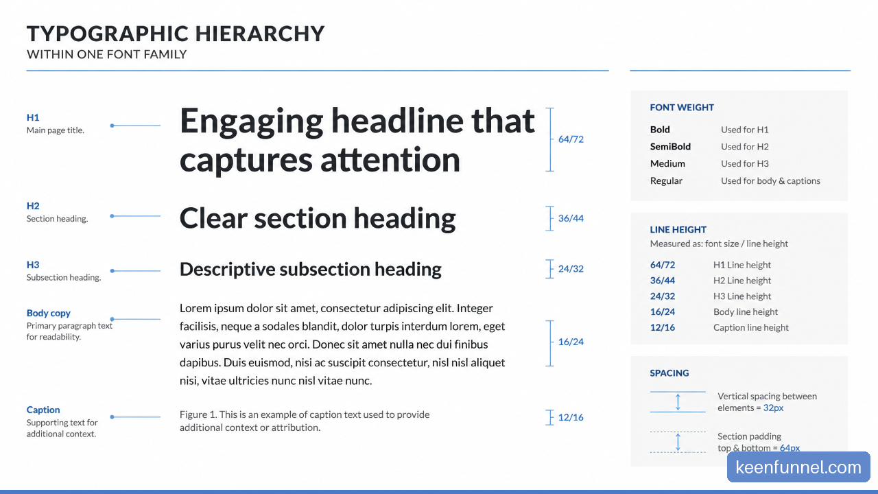
The line height ranges outlined by OneThing Design place body copy commonly around 1.4 to 1.6 times its font size, while headings often work better around 1.1 to 1.3. These are starting ranges, not fixed laws.
Consider a 16px body paragraph with a 24px line height. It has room to breathe on a desktop screen. A 48px heading with the same proportional line height would create a large vertical gap within a two line heading, making it look loose and less decisive. Setting that heading around 54px to 60px line height usually creates a stronger block.
Fair warning: line height is not merely decorative. Too little leading in a dense paragraph makes readers lose their place. Too much leading breaks paragraph unity. A family that looks elegant in large headlines may still be a poor choice if its regular cut requires awkward spacing to remain readable.
When One Family Is the Better Choice
Choose One Family When System Control Matters
A same family system is often a sound choice when a website needs consistency across many pages and interface states. It works especially well when the team manages a design system, publishes frequent content, or supports several products and channels.
Choose one family when these conditions are present:
• The family has enough useful weights, including a clearly visible semibold or bold.
• Body copy is readable at 16px or larger without relying on extreme line height.
• Headings can achieve strong contrast through a scale, spacing, and weight changes.
• The brand benefits from a calm, unified tone rather than a highly editorial or decorative contrast.
• The organization needs simpler governance for web, email, product UI, documents, and templates.
The governance benefit is real. Fewer families generally mean fewer font files, fewer fallback combinations, fewer licensing questions, and fewer exceptions in component libraries. This does not mean every site should minimize fonts at all costs. It means a single family can be a disciplined choice rather than a compromise.
Use Two Families When They Solve a Real Problem
A second family is useful when it adds a capability the first family cannot provide. For example, a brand may need a distinctive display voice for a campaign while keeping long form copy highly readable. An editorial publisher may choose a serif body face for sustained reading and a sans serif for navigation and labels. A technical product may use a monospaced face for code samples.
Avoid adding a second font merely because a single family feels “too simple” in a specimen. In a real interface, that pairing can introduce mismatched x heights, awkward weight relationships, inconsistent numerals, or competing personalities.
Situation | One Family Usually Fits | Two Families May Be Better |
|---|---|---|
SaaS product interface | Yes, for repeatable UI roles | Only when code or a special content type needs it |
B2B service website | Yes, if the family has a strong display range | When the brand needs a distinct editorial voice |
Long form publication | Sometimes, with excellent text rendering | Often, if a reading optimized serif improves long passages |
Campaign landing page | Yes, for a restrained premium feel | When a campaign concept needs a controlled display face |
Dense knowledge base | Yes, if body text is exceptionally clear | When technical code or data needs a separate functional face |
The Situations That Make It Look Amateurish
The problem is rarely “one family.” It is usually insufficient contrast.
A common weak implementation uses a 32px heading in medium weight above a 16px regular paragraph, then uses nearly the same spacing for every block. On a wide screen it may appear acceptable. On a phone, the visual difference shrinks, line wrapping changes, and the heading starts to look like a slightly enlarged sentence.
Other warning signs include:
• A family with only regular and bold weights, where bold becomes too heavy for every heading.
• Long line lengths that make paragraphs hard to track.
• All caps headings paired with tight letter spacing that reduces legibility.
• Headings styled beautifully in English but poorly in languages with longer words or different scripts.
• Mobile styles that reduce heading sizes without preserving enough separation from body copy.
• Decorative display forms used for paragraph text because the brand wants “consistency.”
If any of these appear, the recovery is not always to add another font. First strengthen the type scale, spacing rules, and responsive behavior. If the family still cannot serve the required roles, then a carefully selected second family is justified.
How To Build A Professional Same Family System
Start With Semantic Structure
Typography should follow document structure. An H1 should describe the page topic. H2 elements should identify major sections. H3 elements should organize content inside those sections. Visual styles should reinforce this semantic structure rather than disguise it.
This matters for more than appearance. Clear semantic headings help people scan, help assistive technology interpret page structure, and make the content easier to maintain. Do not choose heading tags because they happen to produce a desired font size. Define the correct HTML level first, then style it.
Create A Small, Repeatable Type Scale
Rather than selecting each text size independently, establish a scale. The precise numbers can vary by family, but a deliberate progression prevents the “almost the same” problem.
Here is a practical desktop starting point for a website using 18px body copy:
Role | Example Size | Weight | Typical Line Height | Purpose |
|---|---|---|---|---|
H1 | 48px to 64px | Bold | 1.1 to 1.2 | Page promise or primary topic |
H2 | 32px to 40px | Semibold or bold | 1.15 to 1.25 | Major section break |
H3 | 24px to 28px | Semibold | 1.2 to 1.3 | Supporting topic |
Body | 16px to 18px | Regular | 1.45 to 1.6 | Continuous reading |
Small text | 14px to 16px | Regular or medium | 1.4 to 1.5 | Captions and secondary details |
These are not universal values. A typeface with a large x height may look larger at 16px than another family at 18px. The point is to preserve meaningful steps between levels.
Test It Where People Use It
A type specimen cannot reveal every production problem. Test your typography in an actual page with a long heading, a short heading, several paragraphs, a bulleted list, a button, a form label, a table, a caption, and an error message.
Then test the same page under realistic conditions:
Review desktop and narrow mobile widths.
Increase browser zoom to check whether the hierarchy remains clear.
Check text on light, dark, and accent backgrounds.
Replace placeholder copy with real language, including long product names and awkward line breaks.
Compare regular, semibold, and bold styles at their final sizes.
Ask whether a reader can identify the next section before reading every paragraph.
If the answer to the final question is no, increase contrast. That may mean a larger size jump, stronger weight, more space above headings, or a tighter heading line height. Do not immediately introduce a second family. Diagnose the hierarchy first.
Key Takeaways
The Practical Standard
• Yes, one typeface family can be professional for both headings and body copy.
• The decisive factor is contrast between text roles, not the number of families in the font stack.
• Choose the body face first because continuous reading places the greatest demand on readability.
• Use size, weight, line height, spacing, and responsive rules together. No single setting does all the work.
• One family is strongest when it includes credible text and display weights, plus good rendering at small sizes.
• Add a second family only when it solves a functional or brand problem that the first family cannot solve cleanly.
A Simple Decision Rule
If your headings remain obvious at a glance, your body copy remains comfortable at production sizes, and your text styles stay consistent across screen widths, a single family is doing its job. If those conditions fail, change the system before changing the font count.
Frequently Asked Questions
Is It Professional To Use The Same Font For Headings And Body Text?
Yes. A one family system can look professional, premium, and modern. It becomes unprofessional only when headings lack enough contrast from body copy or when the chosen family does not read well in long passages.
Should Headings Always Be Bolder Than Body Copy?
Not always. A heading can stand out through size, spacing, case, color, or tighter line height. Bold weight is often useful, but a large semibold heading may be more balanced than an overly heavy bold heading. What matters is that readers can recognize its role immediately.
What Body Font Size Looks Professional On A Website?
For ordinary web body copy, 16px is a widely used minimum starting point. Dense, text heavy pages may benefit from 18px. The best size depends on the typeface, line length, audience, and device, so it should be checked in real content rather than selected by convention alone.
Is One Font Family Enough For A Brand Website?
Often, yes. It is enough when the family provides suitable weights and styles for body copy, headings, navigation, forms, and small supporting text. A second family may be useful when the brand needs a separate editorial display voice or a functional style such as monospace code text.
How Do You Make Headings Stand Out Without Changing The Font?
Use a meaningful size difference, a heavier weight, tighter line height, and clear spacing before and after the heading. For instance, an H2 at 36px semibold with a 1.2 line height will feel substantially different from 18px regular body copy with a 1.55 line height, even within the same family.
When Does A Single Typeface Hurt Readability Or Scanning?
It hurts when the family has weak weights, poor small size legibility, or little visual range. It can also fail on crowded pages where headings, labels, and paragraphs all occupy similar sizes. In that case, stronger hierarchy or a second functional family may be needed.
Do Accessibility Needs Affect This Decision?
Yes. Accessibility makes comfortable body sizing, clear contrast, scalable text, and meaningful heading structure more important. A design that depends on subtle typographic differences may collapse for users who zoom text, use smaller screens, or need clearer visual separation.
Sources And References
• U.S. Web Design System — Typography: https://designsystem.digital.gov/components/typography/
• Hennepin County Design System — Fonts and typography: https://www.hennepincounty.gov/design-system/design/foundations/fonts-and-typography
• Toptal — How to Structure an Effective Typographic Hierarchy: https://www.toptal.com/designers/typography/typographic-hierarchy
• UX StackExchange — Should headings always use the same font as the body?: https://ux.stackexchange.com/questions/766/should-headings-always-use-the-same-font-as-the-body
• OneThing Design — Typography in Web Design: A Complete Guide: https://www.onething.design/post/a-guide-to-typography-in-web-design